

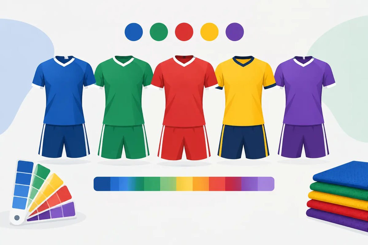
A team kit is seen long before anyone notices the jersey fabric, chamois, or aero sleeves. In a fast-moving group, color is the first signal of who you are. This team kit color guide helps clubs, race teams, and cycling brands build a palette that looks unified in the bunch, photographs well, and performs in real riding conditions.
The strongest designs do not simply use favorite colors. They account for speed, visibility, sponsor requirements, garment construction, and the practical reality that a jersey, bib short, vest, and skinsuit need to work as one system. A sharp concept on a screen can lose impact when it is split across panels, covered by a race number, or viewed from 30 meters away.
Start With Your Team Identity
Choose one dominant color before choosing anything else. This is the color riders, supporters, and competitors should recognize immediately from the road or across the parking lot. For many teams, it is a deep navy, red, black, blue, green, or a high-visibility fluorescent shade. The right answer depends on your identity and where you ride.
A dominant color should cover enough of the jersey to register at distance. If it only appears as a narrow shoulder stripe or side-panel detail, it becomes an accent instead of an identifier. This matters especially for clubs with a large membership base. A consistent dominant color makes different garment styles, rider sizes, and seasonal layers still look like one team.
Then build around it with a supporting color and an accent. The supporting color gives structure to sleeves, side panels, pockets, collars, or bib straps. The accent is used with more restraint - for a chest band, piping, logo treatment, or a sharp panel break. Three colors are often enough. Adding five or six competing shades can make a custom kit look busy before sponsor marks are even added.
Build a Palette That Works at Speed
Cycling apparel is rarely viewed up close and still. It is viewed while riders are cornering, climbing, passing, and sitting in a rotating paceline. High contrast creates recognition at speed.
Dark navy against black, for example, can look refined in a design file but may read as one flat tone in shade or low light. White logos on dark fabric are generally clear, while black logos on bright yellow or white fabric carry strong contrast. A medium-gray logo on a mid-blue jersey may look understated on a computer monitor, but it can disappear on the road and in race photography.
Before approving a palette, test it in three ways: view it at a reduced size, view it from several feet away, and view it in grayscale. The grayscale check is useful because it reveals whether the design relies only on hue differences rather than genuine light-to-dark contrast. If two colors become nearly identical in grayscale, lettering and key graphics may not stay readable from a distance.
High visibility has a role beyond aesthetics. Bright yellow, orange, lime, coral, and vivid pink are practical choices for riders training on open roads, especially in low light or mixed weather. They are not mandatory for every team, and some race programs will prioritize a more traditional, understated identity. But if daily road safety is part of the brief, visibility should shape the palette from the beginning rather than be added as an afterthought.
Use Dark Colors With Purpose
Black and dark navy remain popular for bib shorts because they are versatile, flattering, and better at hiding road spray and drivetrain marks. They also create a clean visual base under a brighter jersey. That does not mean every kit needs black bibs. A colored bib short can make a strong statement, but it increases the need for careful logo placement and may show wear differently over time.
If the jersey is dark as well, introduce a bright or light element around the shoulders, sleeves, chest, or rear pockets. This preserves a race-focused look without turning the rider into a dark silhouette on the road.
Treat White as a Performance Design Choice
White looks fast, crisp, and highly visible. It also provides an excellent surface for sponsor logos and fine graphic work. The trade-off is obvious: white shows road grit, sweat marks, and grime more readily than darker colors. For a criterium team, gravel group, or wet-weather training club, it may be better as a secondary panel than as the primary body color.
White rear pockets require particular thought. They can look clean on the showroom floor, but they sit directly in the spray zone. A darker pocket panel often keeps the kit looking professional for longer without changing the overall design direction.
Match Color Placement to Garment Construction
A cycling jersey is not a flat poster. It is a shaped performance garment made from multiple panels that stretch, wrap, and move with the rider. Color blocks should follow that construction instead of fighting it.
Broad chest graphics are effective, but a design should account for the zipper line. Avoid placing critical lettering or a logo directly where the zipper splits it unless the mark has been designed to tolerate the break. Likewise, long lines that travel from the chest to the side panel can distort when the rider reaches for the bars or fills rear pockets.
Sleeves are valuable color territory. A contrasting sleeve can make a team more recognizable in a group and create a clear location for a short sponsor mark, team initials, or national flag detail. Keep the artwork simple, though. Fine text wrapped around an arm is difficult to read when the rider is moving.
The back of the jersey deserves the same attention as the front. It is the view teammates, drivers, and following riders see most often. Rear pockets interrupt large artwork, so place key elements above the pocket line or design around the pocket structure. A strong upper-back identifier, paired with a clean pocket treatment, usually reads better than trying to force a full poster graphic across three pockets.
On bib shorts, bold side-panel graphics can be highly effective. They are visible during standing efforts, start lines, and podium photos. The seat panel, however, is not the place for delicate branding. It experiences constant saddle contact and motion, so it is better kept clean and functional.
Keep Sponsors Legible Without Letting Them Take Over
Sponsor visibility matters, but a cycling kit should not become a collection of disconnected logos. The best team designs establish hierarchy. The team name or primary sponsor gets the most prominent location, then secondary partners receive consistent, purposeful placements.
Give logos breathing room. A mark surrounded by competing graphics, color transitions, or seams loses impact. This is especially true for small sponsors. A clean one-color logo on a solid panel can be more visible than a full-color logo placed over an elaborate pattern.
When a sponsor has strict brand colors, do not automatically rebuild the entire kit around them. Instead, reserve a neutral or compatible area that lets the logo remain accurate. This protects the sponsor identity while allowing the team kit to retain its own recognizable color system.
Design for the Full Kit, Not Just the Jersey
The jersey leads the visual identity, but riders are seen as a complete kit. Bib shorts, socks, gloves, caps, vests, and winter layers should support the same hierarchy. If the jersey is loud and the bibs are quiet, matching socks can carry an accent color without creating visual overload. If the jersey uses a subtle palette, a bright helmet or sock detail may add useful visibility.
Consider the conditions your riders actually face. A summer race jersey may look perfect with white arm warmers in a design presentation, but a fall club kit needs to work with black thermal tights, overshoes, and outer layers. The core colors should remain recognizable when riders add equipment for colder weather.
This is also where an experienced custom manufacturer adds value. At CCN Sport, design decisions can be considered across race jerseys, bib shorts, skinsuits, triathlon apparel, and outer layers rather than treated as isolated products. That consistency matters when your team grows, adds disciplines, or places a repeat order next season.
Common Color Mistakes to Avoid
A few mistakes appear repeatedly in custom cycling apparel. They are easy to avoid when the design brief is clear:
- Using low-contrast colors for key logos, names, or race identifiers.
- Treating every open panel as space for another graphic or sponsor mark.
- Ignoring how a design changes across jersey seams, pockets, zippers, and stretched fabric.
- Choosing white or very light panels in high-spray areas without considering how the kit will look after long rides.
- Building a palette for one jersey style without checking how it translates to bibs, vests, and cold-weather layers.
Make the Final Decision in Real Conditions
Before production, look at the approved artwork on a rider-shaped template, not just a flat panel. Ask how it reads in sun, shade, rain, and a crowded group. Check whether the main identity is visible from the front, side, and rear. If your team races, consider where race numbers will sit and whether they obscure a critical visual element.
A well-chosen kit color system does more than make riders look organized at the start line. It gives every athlete a clear, confident presence on the road. Build it around the conditions you ride in, the identity you want to protect, and the distance from which your team needs to be recognized.

Share:
Mens Cycling Pants: Complete Guide for 2026
Cycling Sale Clothing: Smart Buying Guide 2026