

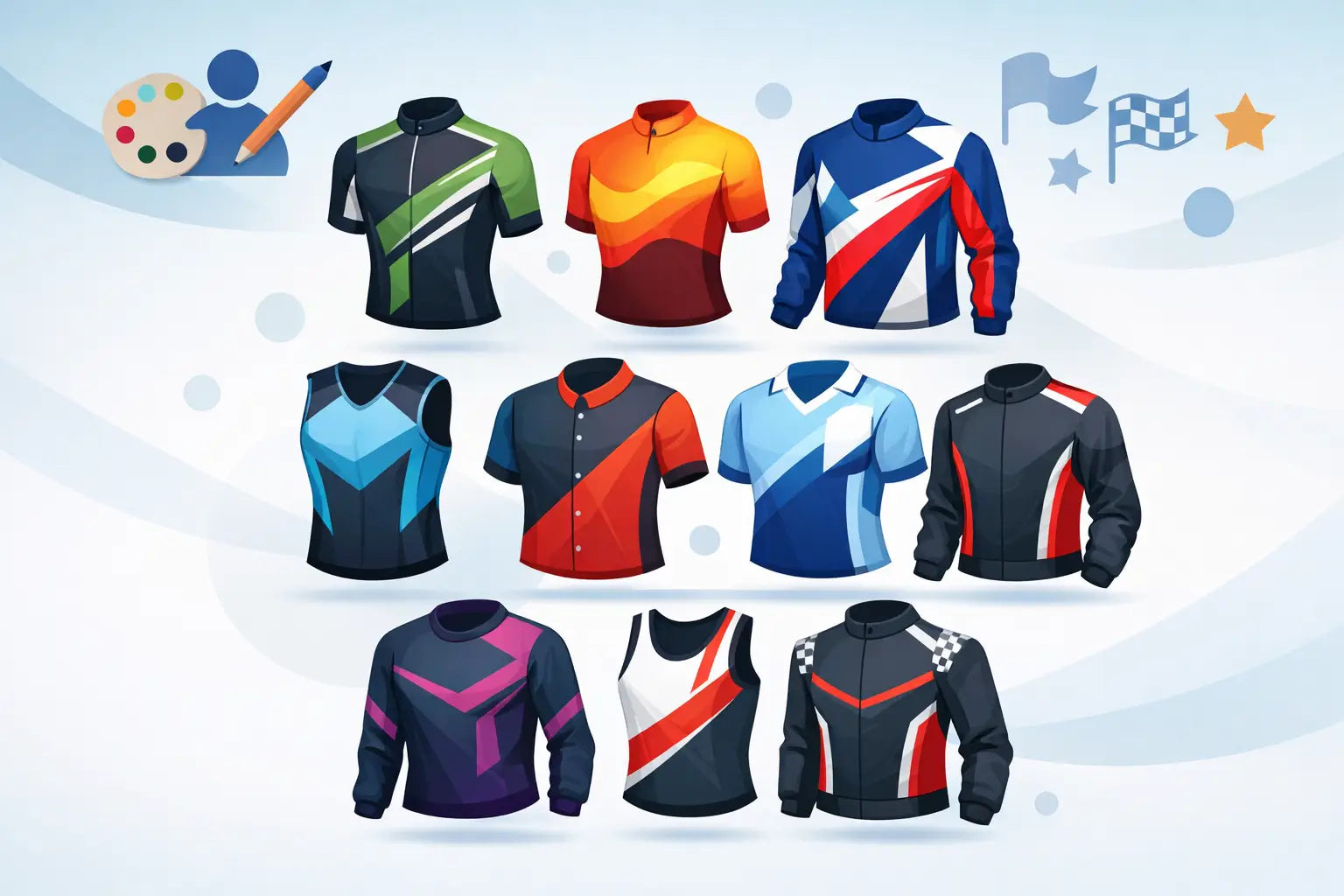
A fast jersey can test well in the tunnel and still fail on race day if the design is wrong. When numbers are hard to read, sponsor logos disappear in motion, or the pattern fights the body position of a rider in the drops, the kit stops working as team equipment and starts acting like decoration. That is why strong custom race jersey design examples matter. They show how graphics, fit, visibility, and function have to work together at speed.
For clubs, race teams, and event organizers, the best designs are rarely the busiest. They are clear, intentional, and built around how a jersey is actually seen - from the front in a sprint, from the rear in a paceline, and from the side in race photography. Good design is not just about brand presence. It affects recognition, confidence, and how professional a team looks when the pace is on.
What strong custom race jersey design examples have in common
The most effective race jerseys do three things at once. They create a distinct identity, they support technical performance, and they stay readable in motion. That sounds simple, but there are trade-offs.
A highly detailed graphic can look impressive on a flat mockup and then break apart once it wraps across panels, pockets, and seams. A very dark jersey may feel premium and aggressive, but it can lose contrast for sponsor marks and reduce visibility in mixed light. A bright design improves recognition, but if every panel competes for attention, the overall result can feel amateur. Strong race kit design is usually disciplined rather than loud.
The body position of a cyclist also changes the way a jersey reads. What looks centered on a standing template may shift when the rider is bent forward. Chest logos compress, side panels rotate, and shoulder graphics become more prominent than expected. That is why race-ready design needs to consider garment construction, not just artwork.
9 custom race jersey design examples that work
1. The pro-block layout
This is the classic race template built around large, uninterrupted color fields. Think solid front panel, clean sleeves, and controlled sponsor placement. It works because it stays legible at speed and gives the team a serious, organized look.
The strength of this approach is clarity. Sponsors get space that is easy to read, and the team color is instantly recognizable in a group. The trade-off is that it can feel conservative if the palette is too safe. The answer is usually not more graphics. It is sharper color contrast or a stronger sleeve detail.
2. The shoulder-driven identity jersey
In racing, shoulders and upper sleeves are visible more often than many teams expect. Riders spend long periods in an aggressive position, and race photos frequently capture the upper body first. A design that uses the shoulder area as a signature zone can be very effective.
This works well for elite teams, development squads, and clubs that want visual distinction without covering the entire jersey in pattern. The key is restraint. A shoulder motif should frame the rider, not overpower the chest branding.
3. The high-contrast sponsor jersey
Some teams need to prioritize sponsor visibility above everything else. In that case, the best design examples use a dark-light contrast strategy. A deep base color paired with white or bright sponsor marks usually reads better than stacking several mid-tone colors together.
This is where many custom kits miss the mark. Sponsors are technically present, but the contrast is too weak once the rider is moving. If the logo matters, build the jersey around legibility first. Decorative elements should support that goal, not compete with it.
4. The heritage stripe concept
A stripe-based jersey is one of the most reliable formats in cycling because it references tradition while still feeling current. Horizontal chest bands, vertical center stripes, or diagonal race lines can all work when they are scaled correctly.
The advantage here is structure. Stripes help organize the design and guide the eye to team and sponsor elements. The risk is distortion across zippers, pockets, and curved side panels. If the stripe system is too complex, panel breaks will weaken it. Simpler geometry usually performs better.
5. The fade or gradient race jersey
Gradients are popular because they add motion and depth without needing heavy graphics. A well-executed fade can make a kit feel modern and fast, especially for gravel teams, triathlon squads, and contemporary club programs.
But this style depends on print control and color discipline. Too many transitions can make logos disappear or create visual noise around seams. The best versions use one primary fade direction and keep the sponsor zones clean. If the background is moving, the branding needs to stay stable.
6. The national or regional identity jersey
Teams often want to reflect a country, state, or local community. The strongest examples do not simply place a flag on the chest and stop there. They build identity through color hierarchy, subtle patterning, and placement that feels integrated with the garment.
This matters because symbolic design can become cluttered fast. Flags, maps, crests, and slogans all carry meaning, but putting them all on one race jersey weakens each element. Usually one lead symbol and one supporting detail is enough. Precision looks more professional than excess.
7. The women’s team race jersey with a tailored graphic flow
A race jersey should not just be resized. The graphic system has to respect the cut. On women’s team kits, the best design examples account for contouring through the chest, waist, and hip so logos stay balanced and visual lines remain clean.
This is a good example of where apparel engineering and design have to work together. A concept that fits a men’s pattern may need adjustment to maintain readability and symmetry on a women’s-specific cut. When done well, the result looks faster and more refined because the artwork follows the garment instead of fighting it.
8. The event or charity jersey with clear storytelling
Event jerseys often try to carry too much meaning. Dates, route profiles, sponsor logos, commemorative icons, and host branding all end up competing for space. The strongest event-focused race designs choose one central idea and let the rest play a supporting role.
For example, a route-inspired line graphic can be powerful if the rest of the jersey stays clean. A cause-driven color story can work if the sponsor placement is controlled. The lesson is simple: not every message needs equal visual weight.
9. The minimalist performance jersey
Minimalist does not mean plain. In a race setting, minimalism can be one of the sharpest design choices because it emphasizes fit, cut lines, and precision. A clean base with limited accent color, subtle texture, and focused branding often feels premium and race-ready.
This approach works especially well for teams that want a modern aesthetic and strong long-term usability. The trade-off is that every detail has to be right. If the typography, color balance, or logo scale is off, there is nothing to hide behind. Minimal designs demand confidence.
How to evaluate custom race jersey design examples before production
The right concept on screen is only the starting point. Before approving a race jersey, it helps to review the design in the context of the actual garment. That means checking how artwork runs over panel seams, where pockets interrupt the rear graphic, and whether sleeve finishes cut through important elements.
Visibility should also be tested in motion. Ask a simple question: from twenty feet away, can you identify the team and read the main sponsor? If not, the design likely needs stronger contrast or better hierarchy. Race kits are viewed at speed, from odd angles, and in changing light. Precision matters more than novelty.
Fabric choice also changes the result. Lightweight race materials can stretch differently across the torso and sleeves, which affects pattern density and logo shape. Aero sleeve fabrics, mesh side panels, and rear pocket constructions all create different print behaviors. A design that ignores those differences may look uneven once produced.
This is where working with an experienced custom manufacturer makes a real difference. When design, patterning, and production are aligned in-house, there is far less guesswork between concept and final kit. That matters for teams that care about repeatability, sponsor accuracy, and on-time delivery as much as style.
What teams should decide before starting a jersey design
Before the first mockup, teams should be clear on a few fundamentals: who the jersey is for, where it will be raced, and what matters most between branding, visibility, and aesthetic style. A crit team may want sharper recognition and bold contrast. A gravel program may lean toward a more textured, lifestyle-informed look. A triathlon team may need cleaner front-of-body branding for race photography and sponsor exposure.
Budget and reorder needs also shape smart design decisions. Highly specific event graphics can be great for one-off projects, but a core team jersey usually benefits from a system that can be reused across seasons. That does not mean boring. It means building a recognizable identity that can evolve without starting from zero each year.
For teams working with multiple rider categories, consistency matters too. The race jersey should translate across men’s, women’s, and youth cuts without losing its visual integrity. If the design only works on one sample size, it is not ready.
A strong race jersey earns attention before the rider attacks and keeps earning it after the finish. The best designs look sharp in photos, read clearly in the bunch, and still feel right six months later when the team places the reorder.

Share:
Custom Club Kit Launch Example That Works
Skinsuit vs Two Piece Kit: Which Is Faster?